
Dead Canyon
Project Type: Academic
Team: Double Dice (18-person team)
Time: January - April 2023
Made Using: Unreal Engine 5
Role: Level Designer/Minor Environment Artist
An FPS game where you play as a cowboy dealing with the undead. In a canyon.
Key Lessons Learned:
Scaling - Make sure that the level size is just right for the player and always keep a reference object for that matter.
Synergy - Making levels that actively taught and encouraged use of the game’s mechanics.
Multi-discipline - Being able to communicate with different departments to make our level great!
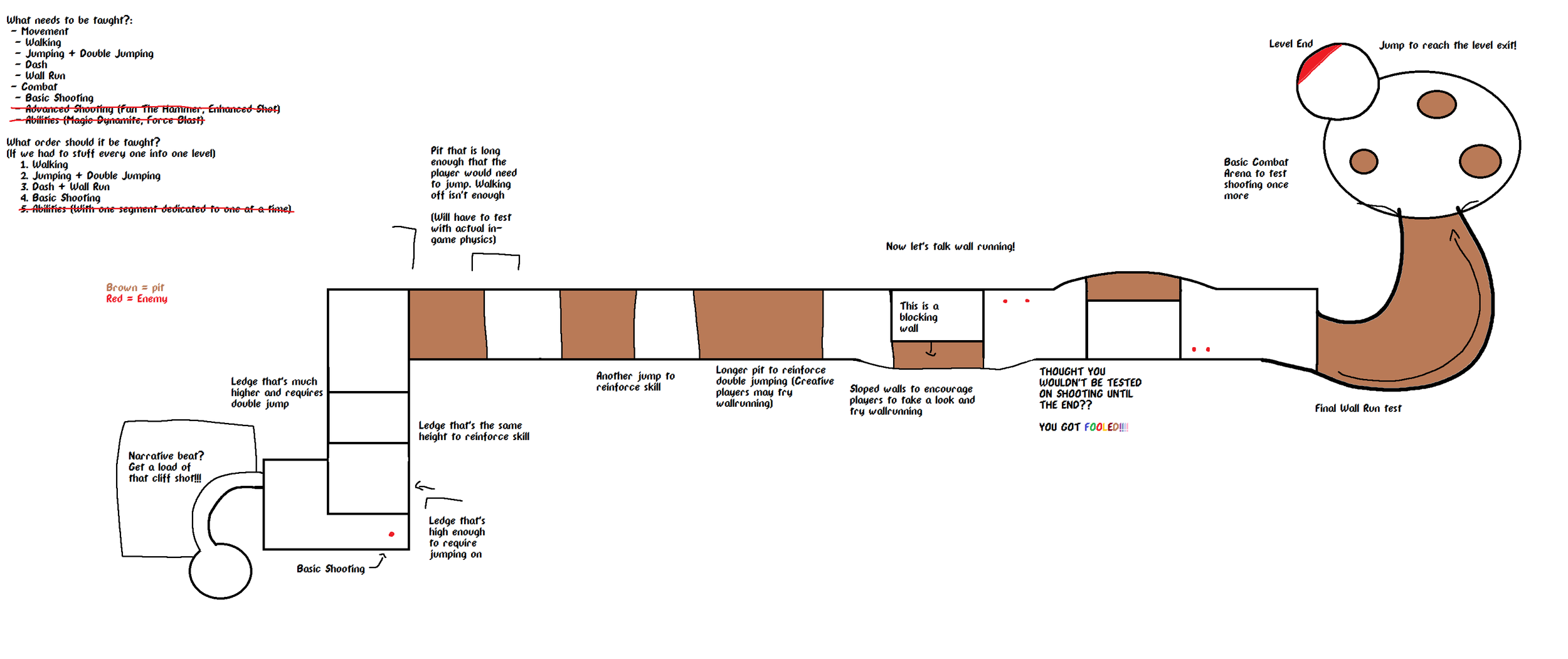
Sketch of Level 1. This is meant to be the tutorial level. The sections were designed in a way to teach the player the basic mechanics without explicitly telling them. The jump cliffs towards the left of the picture are a great example of this.
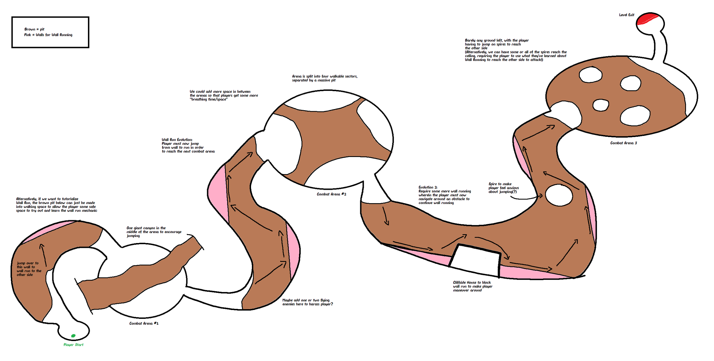
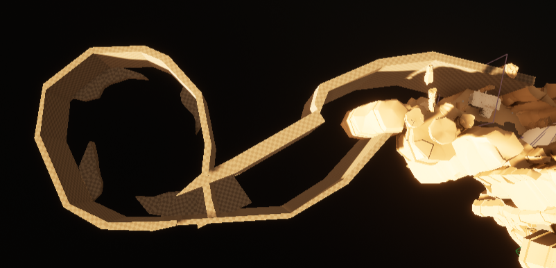
Sketch of Level 2, which is themed around using the player's Wall Run ability with plenty of areas that encourage its use. Ironically, Level 2 was the first level designed by me for this game!
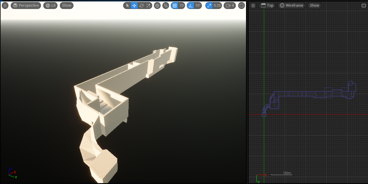
The very first draft of Level 1 in-engine. Level 1 did have some changes to it throughout development, but they were more so additive compared to what happened with Level 2.
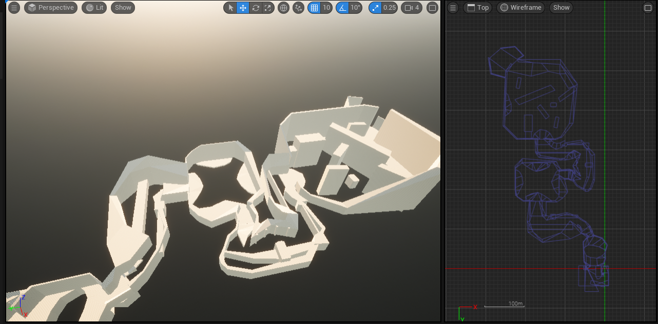
The very first draft of Level 2 in-engine. This layout was done in about two days but the latter half was redone for reasons explained below.
I came into Team Double Dice fairly late, halfway through the year, but I was still the life of the party. I feel like working on Dead Canyon was definitely a highlight of my “career” at DigiPen as my work here showcases a lot of my growth as a level designer but also how quickly I can work.
However quick doesn’t always mean great. A big problem I had early on in with my level design is that I tend to underestimate the size of the player, leading to larger spaces than intended.
Redoing Some Sections,
or What Do You Mean Players Are Having a Hard Time Navigating The Third Arena?
Playtesting revealed several problems about Level 2’s latter half: they were too big.
The final arena, Arena 3, in particular brought a lot of different issues from playtesters. The most consistent being that players did not know where they needed to go in that area. The cluttered geometry blocked the player’s view when they first entered the arena, making their “path” ambiguous. A lot of testers stumbled through the area, trying to wall run on spots they weren’t supposed to.
Other areas, such as Wall Run Section 3, suffered from a similar problem. Players were meant to jump off the wall and then back onto the other side, but players kept jumping to spots they weren’t supposed to.
The long walls of the wall run sections also gave our programmers grief because the long walls meant players would run out of speed and fall off. Mistakenly, I just thought there wasn’t enough speed for players and asked programmers to make the wall run speed faster. However, after some discussion, we ended up realizing that my design was ultimately at fault and needed to be shortened.
As the problems started adding up, me and our design lead, Zach Johnson, went back to the drawing board with several of the sections in Level 2 and, after agreeing on the new designs, I went straight to work!
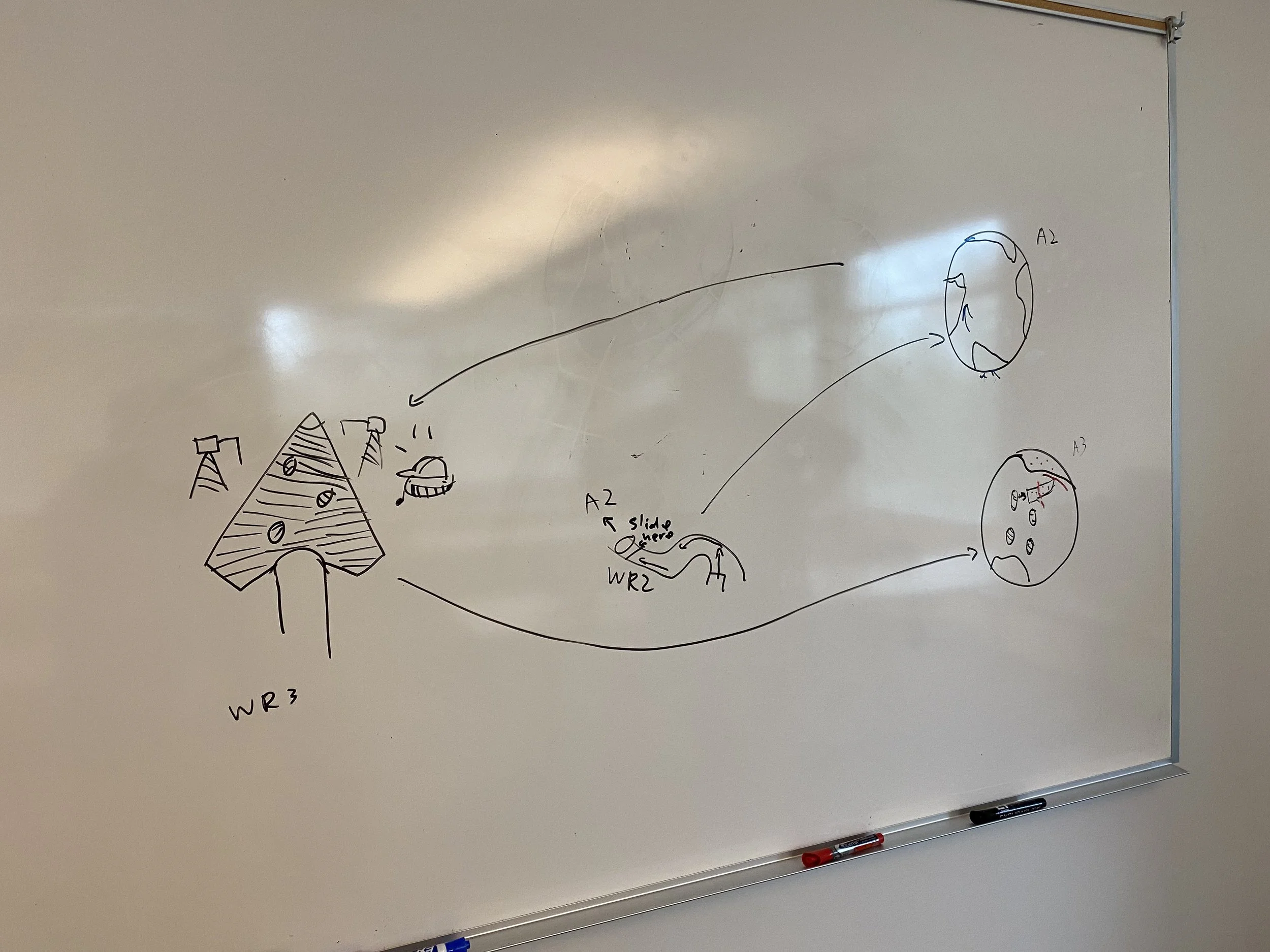
Whiteboard sketches for redoing Level 2 sections between our design lead, Zach, and me. A lot of these ideas here were actually Zach's and they were great. Start from the center and then follow the arrows!
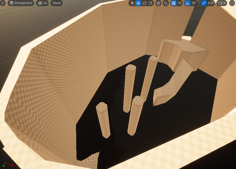
The original whitebox for the second "Wall Run" segment in Level 2. It doesn't look like it, but it's quite big!
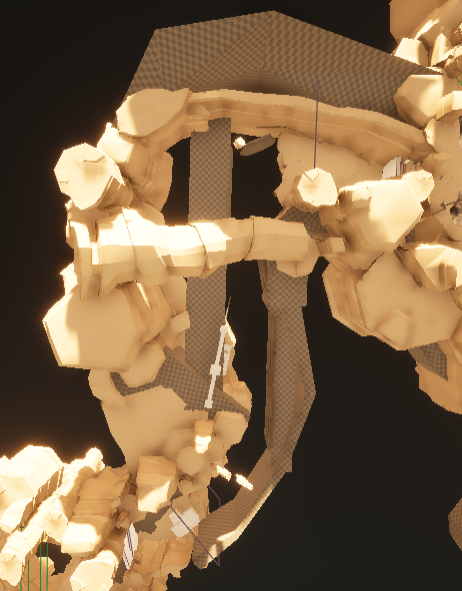
Same as previous image but at a different angle
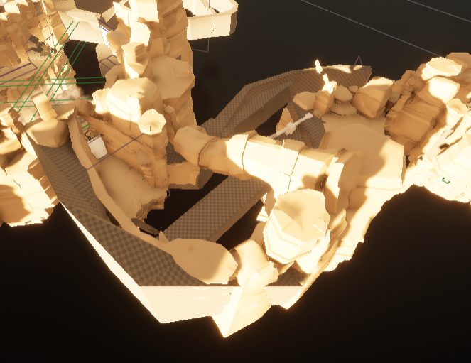
Same as previous image but at a different angle
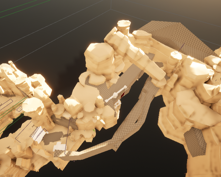
Whitebox for redoing Level 2's second "Wall Run" segment + the second arena. It's smaller and more concise but it still has the same intent.
Whitebox for redoing Level 2's third arena. Smaller but still preserves the intent of players wallrunning towards the enemies on the other side alongside having a clearer sightline to show players where to go.
The main thing we did was shrink those sections and provide better sightlines.
We wanted to preserve what we wanted the player to do in those areas but the idea was that it should be clearer to the player where they should be going while also shrinking the spaces’ size so they don’t overstay their welcome.
Arena 3 got the most drastic change and I would say that I’m more proud of my second-pass on Arena 3 than my first draft of it. It’s a lot more faithful to my original sketch of it.
These second passes were a bigger hit with playtests and we’ve never looked back since.
Overall, working on Dead Canyon was a very fun experience. It was a lot of fun hitting the ground running and building the whiteboxes for the levels.
Most importantly, this project really taught me how to work on a multi-discipline team as a Level Designer. I got to work with the various departments of our team, such as programming for level logic like gates to block the player and enemy spawning, and art for populating the level with art assets while retaining the intent of the spatial design.
